In this post, we will go over five new web design trends that will help you in building better websites for users in 2023.
It is expected that 2023 will bring us an interesting mix of web design trends, one that addresses larger scale scenarios and issues like accessibility, UX, and responsiveness.
The following post covers 5 newest web design trends and 10 pre-built BeTheme websites that demonstrate how to implement them.
A world-famous WordPress theme with 268,000+ sales and a 4.83/5 star rating is BeTheme.

– Table of Contents
Web designers must think on top web design trends more broadly about what impacts (both positively and negatively) digital experiences. The following web design trends for 2023 will address these larger issues:
Web design places a high value on creating intuitive interfaces so that anyone can interact with them. Nevertheless, some shortcuts used in web design — especially when it comes to iconography — can create obstacles for certain users and prevent them from using the site.
Using icons in website headers has become so commonplace that most, if not all, users know what they’re used for and what’ll happen if they click on them.
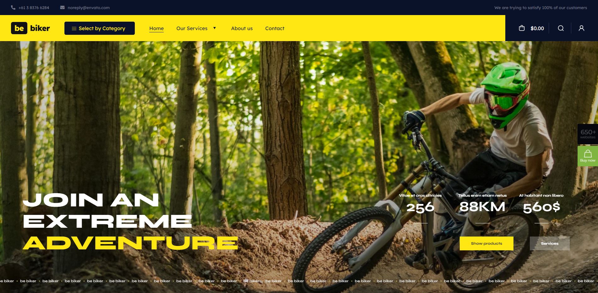
For example, on the BeBiker 4 website, there are three icons for:
- Account
- Search
- Shopping bag/cart

If the iconography is the same from site to site, users will have no difficulty figuring out how to use it.
However, when you use other icons that are less frequently used, you need to consider how your users may interpret them differently based on their diversity.
Web designers will begin including hover-triggered helper text over icons by 2023 in order to improve user confidence while interacting with website iconography.
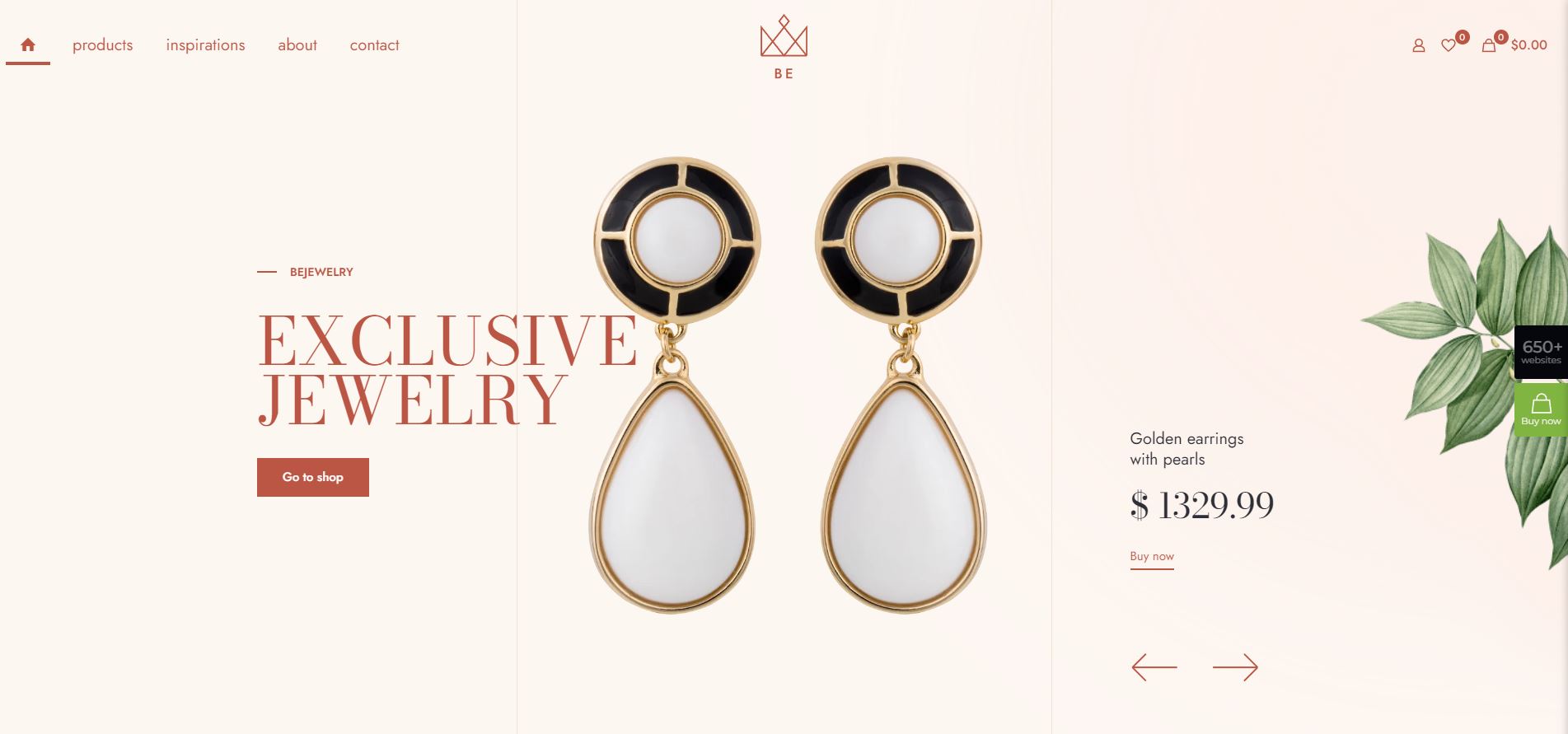
Here’s an example from BeJeweler 2:

As well as revealing helper text when users hover over product icons, variant swatches will also reveal helper text. This leaves no room for interpretation and ensures that all users can interact with website content confidently.
Be it personal relationships or professional ones, trust is an integral part of building relationships.
The website often serves as the first point of contact between consumers and brands, so web designers will use social proof and trust marks to build trust.
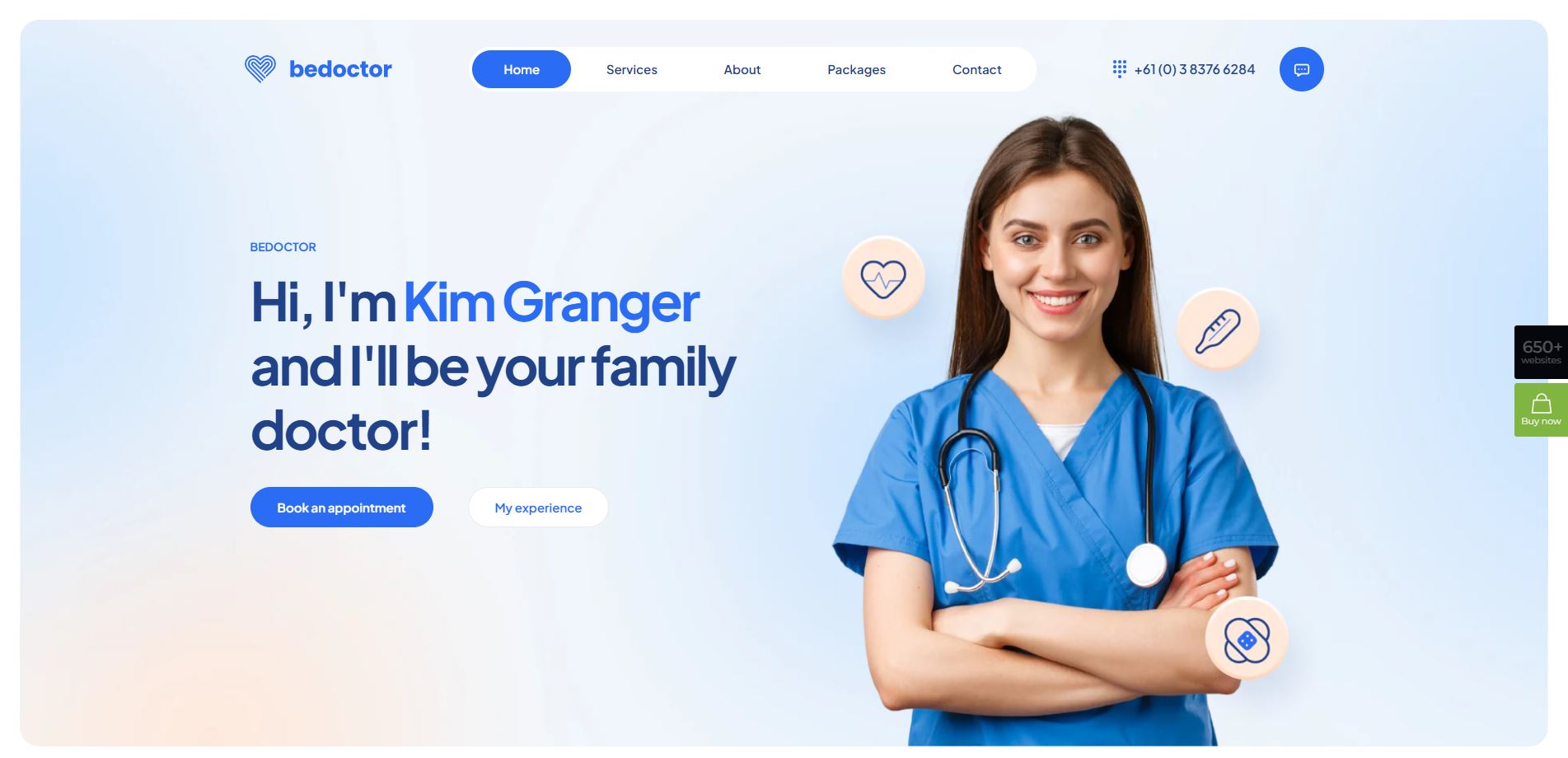
On websites, these trust builders can be used in several ways, such as including testimonials and reviews on the home page or on a page dedicated to these, as on the BeDoctor site.

There are three different types of content that can be used to build trust with visitors to a website:
- An overall customer satisfaction rate
- A customer testimonial
- An average customer rating — which can link out to a ratings platform like Google or Yelp
If you don’t have any social proof to display on your site because you are too early in the game, trust marks are your best option.
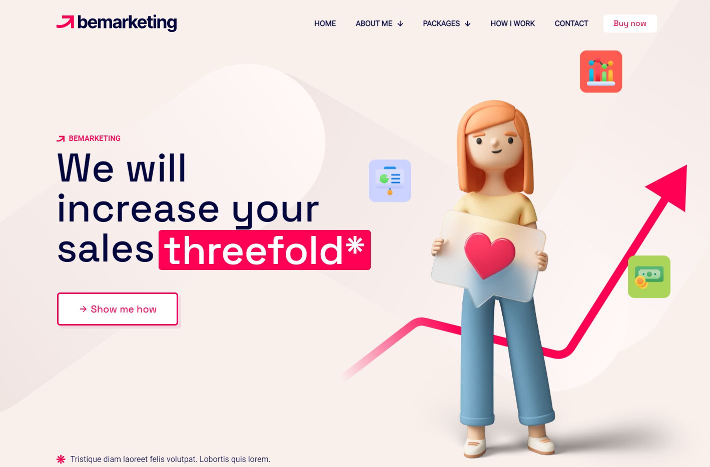
The trust mark can be a security seal — a symbol next to the “Checkout” button so visitors know their transactions are safe. It is also possible to boost credibility and trust by adding context to website claims, as BeMarketing 2 shows:
Down below, you can provide a disclaimer or direct readers to a source of proof by using the asterisk next to the claim.

Every year, responsive design becomes easier to do since the general rules are well known and easy to follow. Also, the vast majority of WordPress themes are designed to be responsive, which simplifies the process for designers.
Mobile web design has, however, stagnated. Even though responsive websites provide an excellent user experience, designers are not encouraged to look for creative ways to improve them.
In 2023, that will change as designers pay more attention to the mobile experience. Specifically, how they build features that address mobile-specific challenges.
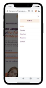
We can see this in the navigation design of the BeLanguage 4 pre-built website.

There are all the links from the regular, non-mobile website; however, on mobile, the “Call us” button appears at the top of the list of links. On desktop, it appears at the bottom.

We will see small deviations in the way major components like the navigation are designed as designers evaluate user habits and goals.
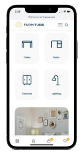
In 2023, more and more websites will adopt mobile-app-like features. BeFurnitureStore has adopted this.
Rather than retaining the multi-level header, the account, cart, and favorite links now appear in a sticky bottom bar:
Designers who transform and reinvent the mobile web experience will be able to position their websites as superior offerings in the future.
The skeuomorphism design trend brought real-world textures to our computer and smartphone screens years ago. However, those textured backgrounds soon became extraneous and distracting, and so the design trend was abandoned.
The idea of digital texturization does not have to fail just because one web design trend fell out of favor.
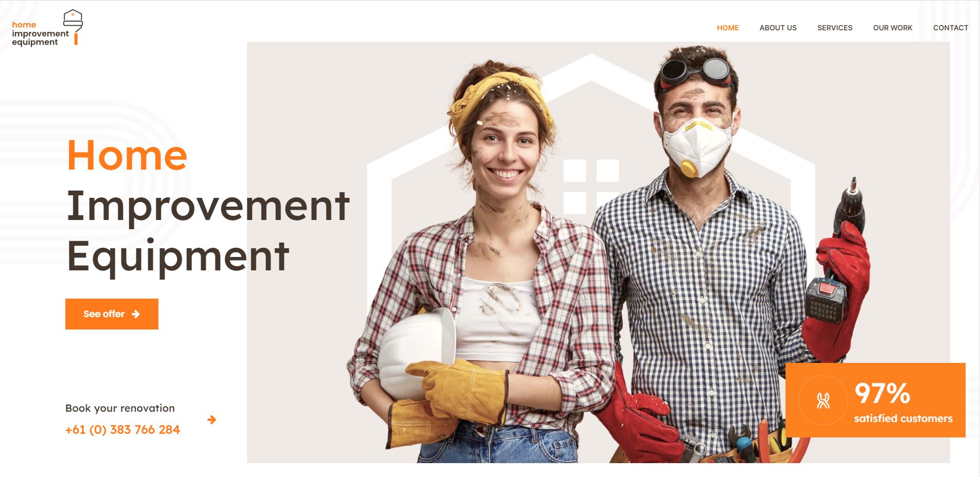
Using organic shapes to add small and strategic textures to web designs will be in vogue in 2023. Take a look at the BeRenovate 5 website for an example:

A variety of rounded shapes and lines appear in the background of the site’s pages, adding visual interest without overpowering it.
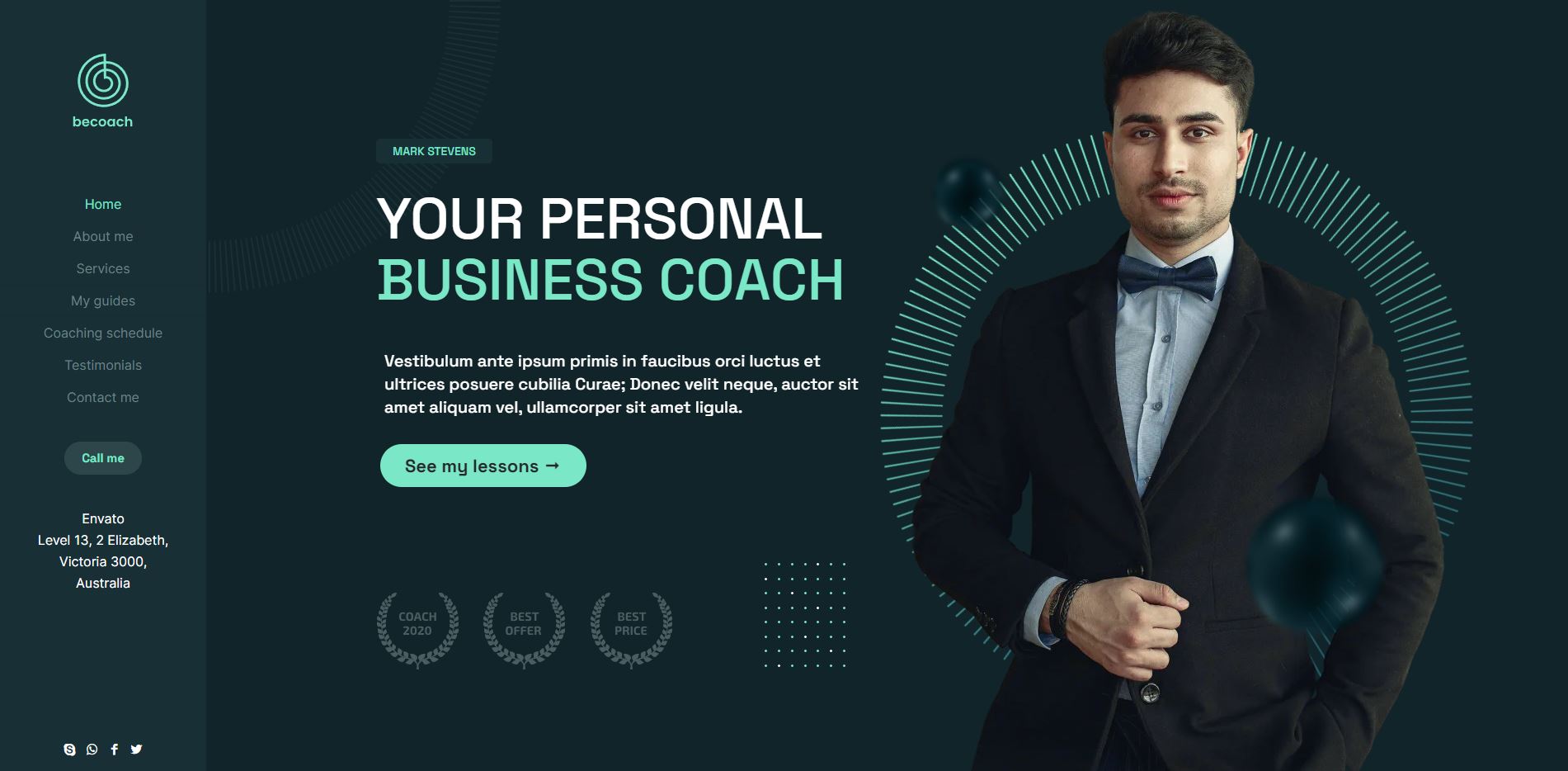
Using digital texturization strategically can also be beneficial. BeCoaching 3 is a good example of how to draw users’ attention to certain areas of your website:

Throughout the one-page website, two shapes comprise the texturization. This consistency will make it easier to direct the visitor’s attention to the desired destination.
Because users’ eyes are usually drawn to the left margin, these shapes should increase the amount of content that users see and interact with.
The way users consume content online is different for everyone. A blog is good for those who like to read, while video posts or vlogs are great for those who prefer to watch or listen.
Although you might be able to provide audiovisual alternatives to every piece of content you place on your web page, you can’t.
For instance, if you try to deliver a personalized experience for content consumption, the design could easily become out of hand.
Additionally, videos are usually very heavy files, which can slow down loading speeds as you add more.
In 2023, designers will only include video alternatives when it matters.
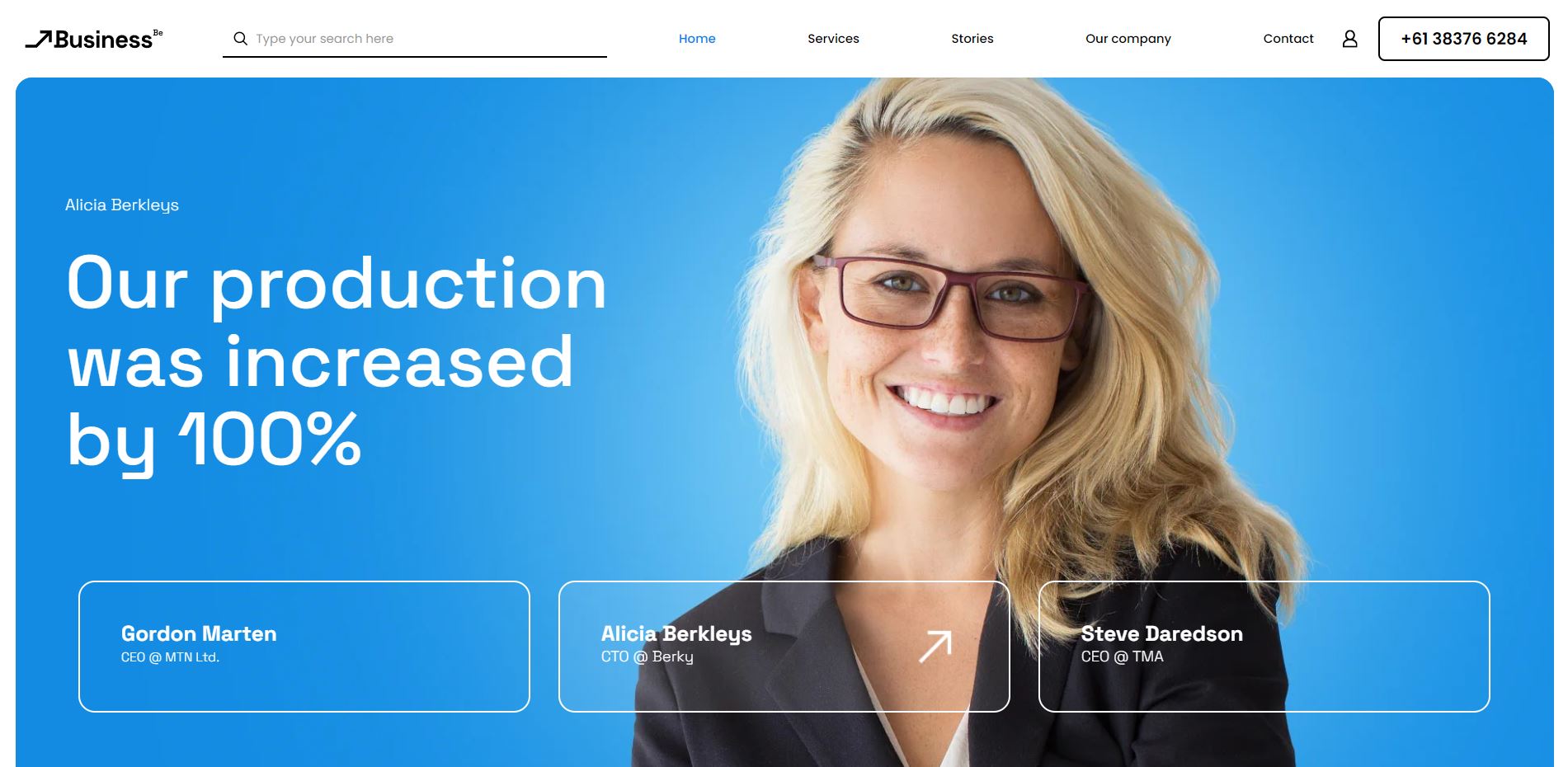
Halfway down BeBusiness 6 home page is a full-width video section.

You could use this video section for a variety of things. To show off video testimonials. To summarize all the content that came before. To explain the product’s technical features in an easy-to-understand manner.
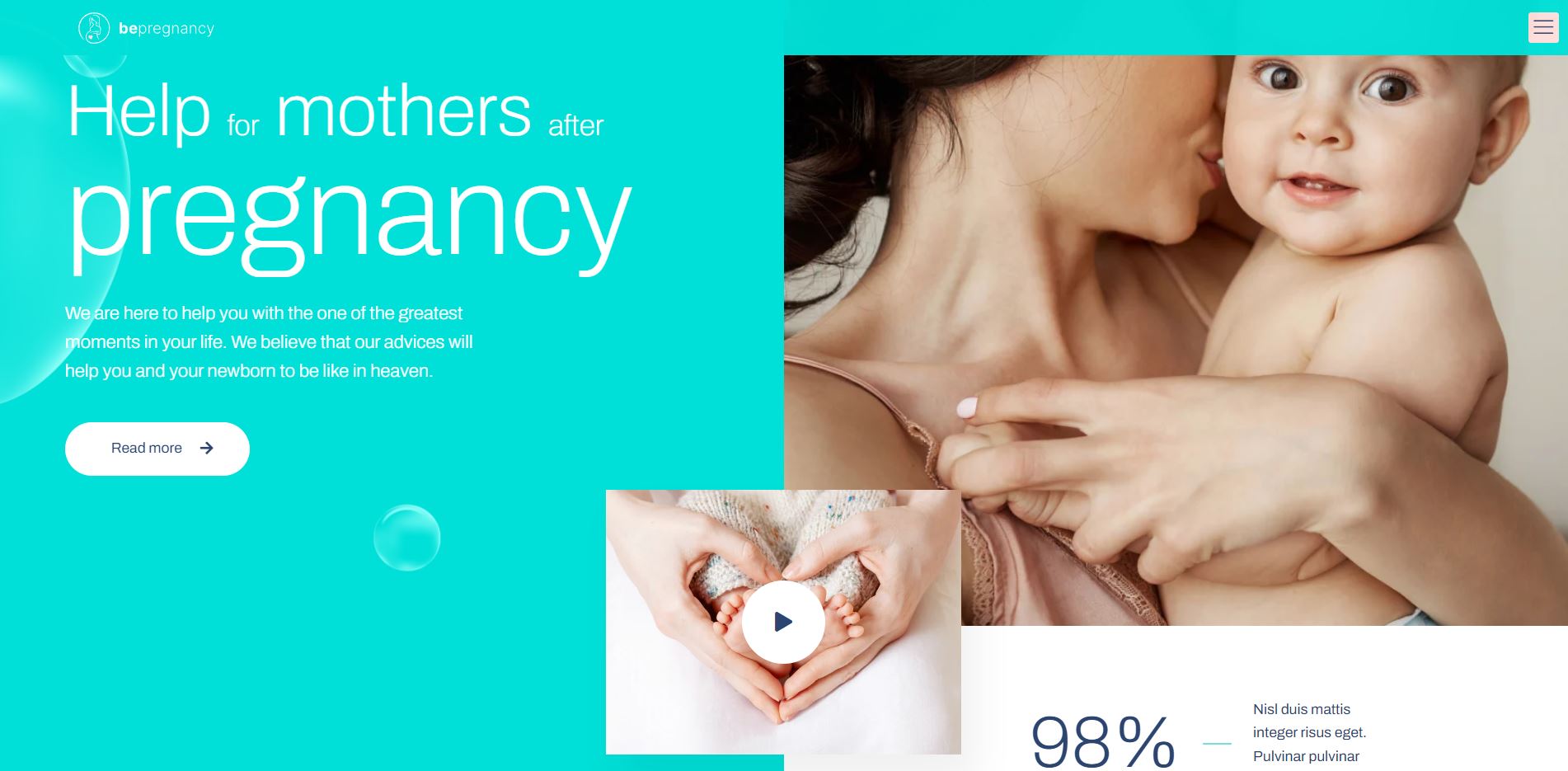
You don’t need a lot of space for supplemental video in order for it to be effective either. For instance, the BePregnancy hero section has a small cut out where there is a video:

It’s simply a matter of clicking on the “Play” button to let visitors know that there’s something to watch (if that’s their preference). Again, the content here can serve numerous purposes.
Using video sparingly and strategically while moving away from autoplay video backgrounds and sections can help designers improve page loading speeds.


